1. Introduction
The population of England is projected to grow by 7.5% over the 10-year period to mid-2024. At the local authority level the rate of change varies considerably, ranging from a projected decline in Barrow-in-Furness (North West) of 4.3% to a projected increase of 25.1% in Tower Hamlets (London). This article will demonstrate the tools and datasets available on the Office for National Statistics (ONS) website to help understand projected population change in an area. By looking at 3 different example areas: Southwark (an urban area), Wealden (a rural area) and Newcastle upon Tyne (a student area), it will show how the rate and main drivers of projected population change vary depending on the type of area and the age and sex structure of the population.
Back to table of contents2. Using interactive maps to look at projected trends
Figure 2.1 shows the interactive population maps available for viewing the results of the 2014-based population projections for local authorities. They can be used to illustrate how the 3 components (natural change (births minus deaths), within-UK migration and international migration) affect the projected population change over the 10 years to mid-2024. Local authorities with projected growth are displayed in green. Areas with a projected decline over the next 10 years are shown in orange. The darker the colour the more growth or decline is projected.
Figure 2.1: Interactive maps showing projected population change for local authorities in England, 2014 to 2024
Embed code
Looking at the population change map, the London borough of Southwark is projected to increase by 14.3% over the next 10 years. This change is high relative to other areas across the country so is shown in dark green. Looking at the components of change maps, we can see that this increase is made up of an increase of 13.4% due to natural change, a rise of 13.5% due to net international migration and a reduction of 12.8% due to projected moves out of Southwark to other areas in England and to the rest of the UK.
The projected trends we see for Southwark are fairly common across London boroughs and in other business and education centres across the country. These areas tend to attract international migrants but have a net loss of people to other local authorities in England and to the rest of the UK.
Back to table of contents3. Looking at the age and sex structure of the population
The interactive population pyramids provide a good way of understanding projected trends. They provide a picture of the age and sex structure of the population in the base year and show how this changes over the course of the projection.
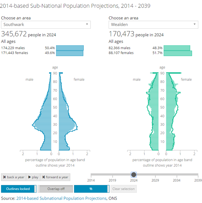
Figure 2.2 shows the population pyramid for Southwark. The population at mid-2014 is shown as an outline on the graph. The shaded area represents the projected population at mid-2024.
Figure 2.2: Interactive population pyramid for areas in England, 2014-based projections
Embed code
From the population pyramid in Figure 2.2 we can see that Southwark has a young age structure with a high number of people in their mid 20s to mid 30s. With a higher number of women of childbearing age more births are projected. Due to a relatively low number of people at the older ages, there are fewer deaths projected. The combination of high births and low deaths leads to the positive natural change trend identified in the interactive population maps.
If we compare the mid-2014 and mid-2024 population we can see the largest projected growth for Southwark appears to be for those in their 30s to mid 40s and in their mid 50s to late 60s. Some of this growth will be due to the ageing of the population and relatively larger cohorts moving into older age groups. However, some of this change is due to the impact of migration.
Back to table of contents4. Using published datasets for further analysis
For the 2014-based subnational projections, very detailed datasets which contain projections data by local authority, single year of age and sex for each year of the projection are available for downloading from our website. The purpose of these datasets is to allow further analysis to be undertaken and for data to be aggregated for age groups and geographical areas of specific interest. The following datasets are available:
Projected internal migration (movement between local authorities in England)
Projected cross-border migration (movement between England and the rest of the UK)
Projected international migration (movement between England and countries outside of the UK)
These datasets can be used to explore trends identified in the interactive tools further. For example, in the case of Southwark it might be interesting to compare the age and sex structure of migrants coming into the borough with the age and sex structure of those moving out of Southwark or to compare the age profile of international and internal migrants.
Back to table of contents5. Comparing different areas
The drivers of population change for more rural areas tend to be different to the patterns seen in areas such as Southwark. For example, Wealden is classified as a predominantly rural local authority in the South East of England. Similar to Southwark, Wealden’s population is projected to grow over the 10-year period to mid-2024 with a projected increase of 10.1%. However, the factors driving this change are quite different to those seen in Southwark.
For Wealden the projected increase in population is made up of a decrease of 1.9% due to natural change, a rise of 1.2% due to net international migration and a net increase of 10.9% from people moving into Wealden from other areas of England and the rest of the UK.
Tools are available to compare the population pyramids for 2 areas. It might be useful to compare the pyramid for a local authority with the pyramid for its region or for England as a whole. We also might want to compare 2 local authorities. There is also the option of displaying the figures as numbers or percentages. When looking at the population pyramid for one area, initially it is useful to look at pyramids based on the number of people of each age. It might also be useful to look at the percentage each age contributes to the total population. However, when comparing 2 areas of different population size, it is better to view the pyramids as percentages so that trends can be directly compared.
Figure 2.3 shows the population pyramid for Southwark (our example urban local authority) against the pyramid for Wealden (our example rural area). By viewing the data in this way the different age structures of the 2 populations can be compared. It is also possible to overlap the pyramids to more clearly see the differences for particular ages.
Figure 2.3: Comparison of the population pyramids for Southwark and Wealden
(for illustration only, not interactive)
Source: Office for National Statistics
Download this image Figure 2.3: Comparison of the population pyramids for Southwark and Wealden
.png (146.1 kB)
Wealden has an older population structure than Southwark. With a lower number of women of childbearing age relative to the population of older ages, fewer births but more deaths are projected for this area. This results in the negative natural change trend identified in the interactive population maps.
When looking at the population pyramid for Wealden we can see what appears to be a projected decline in the population aged in their 40s. Care needs to be taken interpreting some of these trends. Undertaking further analysis using the detailed migration datasets available we can see that although Wealden is projected to see a very small net outwards movement of people at particular ages in their 40s to other countries of the UK and to the rest of the world, this is far outweighed by a projected net gain of people from within England. The dip in the population aged in their 40s is a result of a smaller cohort (who were in their 30s in mid-2014) replacing a larger cohort (who were in their 40s in mid-2014) 10 years later and does not reflect net outward migration at these ages.
Back to table of contents6. Population turnover
Up until this point we have focused on looking at population change over a 10 year period to understand projected trends within an area. Although this is useful to get a high level view it can hide trends occurring within a particular year. The detailed datasets available on our website can be used to explore trends further.
Figure 2.4 shows the population pyramid for Newcastle upon Tyne, a local authority in the North East of England.
Figure 2.4: Interactive population pyramid for areas within England, 2014-based projections
Embed code
Newcastle upon Tyne’s pyramid is typical of a university city. The peak at ages 18 to 21 reflects the student population.
For areas with a high number of students, there are many young people who migrate into the area for study but then leave after they have completed their course(s). The population for this age group therefore remains fairly static over time.
Figure 2.5 shows the average annual projected population turnover for local authorities from mid-2014 to mid-2024, created using the detailed datasets above. Population turnover is a measure of population stability and provides an indication of the intensity of migration into and out of a local authority. In this context, average annual population turnover for an area has been calculated as the sum of in-migrants and out-migrants for the 10 years to mid-2024 as a proportion of the sum of the population over the period mid-2014 to mid-2023. Migration in- and out-flows include the movement between local authorities within England, to or from Wales, Scotland and Northern Ireland and to or from the rest of the world.
Figure 2.5: Average annual projected population turnover for local authorities in England, 2014 to 2024
Embed code
When we select Newcastle upon Tyne from the drop down list in Figure 2.5 we can see that this local authority has high population turnover for those in their late teens and 20s. Population turnover peaks at ages 19 and 22 reflecting the ages at which students tend to start and finish their studies.
It is useful to compare the graph for Newcastle upon Tyne with graphs for other areas. Southwark shows a more complex picture with higher projected population turnover than Newcastle upon Tyne at most ages. Like Newcastle upon Tyne, Southwark shows a peak in population turnover for those aged 19. Some of this peak will reflect the movement of students attending the university and colleges offering higher education courses within the borough. However, Southwark’s population turnover figures are also influenced by international migration, non-student internal in-migration and high internal out-migration, with high projected population turnover particularly for those in their 20s and 30s.
The population turnover graph for Wealden also shows a peak at age 19 which reflects the population moving out of the area to attend university. Wealden generally shows more population stability than Southwark. It has a slightly higher annual average percentage of population turnover for those aged 35 and over than we see for Newcastle upon Tyne. Population turnover at these ages is predominantly due to internal migration into and out of Wealden from and to other parts of England.
Back to table of contents